The Best Interior Design Trends For 2018 From Maison L’Objet

Twice a year, designers, stylists, journalists, architects and buyers all converge in Paris. They’re looking to see the best and the brightest of the products and brands that will shape the trends for the next six months. And with thousands of companies on show, it can be hard to say what will have the biggest impact, which is why we’ve created this top Maison L’Objet list of the trends with staying power.

The Best Interior Design Trends For 2018 From Maison L’Objet

Heart of Glass

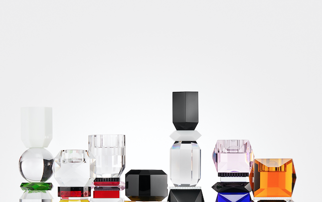
Glass refuses to be invisible anymore. It demands attention now in the boldest forms, from mirrors, candlesticks and bowls. Reflections Copenhagen dazzled with unashamedly bright and brassy shaped hues. Surprisingly, all the objects still felt distinctly luxurious and desirable, the rejection of quietly tasteful seeming confident rather than crass. A fun and affordable way to embrace this trend is to scour car boot fairs and junk shops for ‘Ruby Red’ glass, popularised in the 50s and 60s. A grouping together on the window sill or lit shelf look dramatic as the light pours through. Add in a bright shot of fabric in a roller blind to amplify the look.

Maker’s Hand

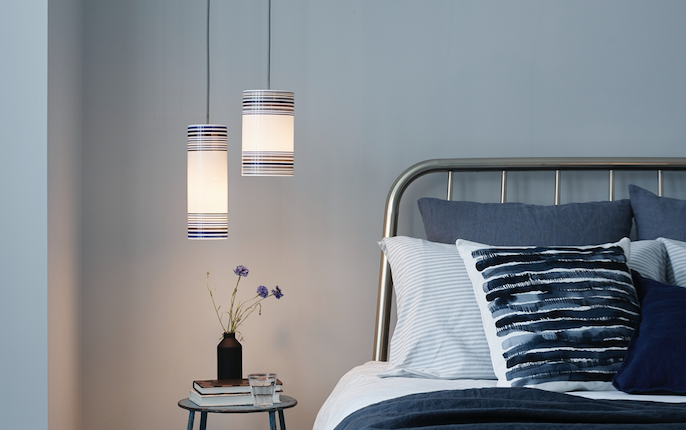
Mass-produced products may have their benefits, the reliable, accurate stitching and clean lines, but there is a yearning for the human in homeware emerging. Several brands have created hybrid items combining the best of both worlds. Lighting company Original BTC introduced pendants with painted rings. These bring the consistency and reliability of precision production, but with a touch of softness to schemes like this calming bedroom. This trend can also be seen in digital prints of watercolour designs on fabric and blinds and unique hand-glazed pottery.

Feeling Good

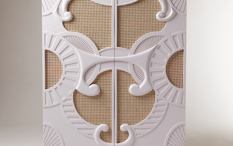
Wellbeing in design is everywhere. From the re-emergence of houseplants to purify air and bring organic, feel-good style, to the inclusion of natural materials in luxury product design. This cabinet from Dooqdetails.com takes a stylised Rocco feel and matches with the more 1970s rattan detailing. Although lacquer and rattan have been mixed before, this new take feels like a much more edgy clash of opposing worlds and rather than traditional lacquer tones of deep red or black, this white overblown styling rewrites the script. Rattan and cane aren’t going anywhere, so these styles make good investment pieces.

Big in the 80s

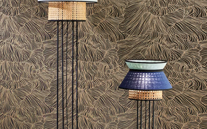
It’s back. And it’s bold. Not the big hair, but the look of iconic group Memphis that ruled the design scene between 1981 and 1988, founded by Italian icon Ettore Sottsass. Known for their use of bright and pastel colours, moulded plastics and geometrics, they took inspiration from Art Deco and Pop Art. French lighting designer Market Set are using the signature black lines that capture this look in their latest standard lamps, with the off key tones that complete the look. Not for everyone, but certainly delivers design points in abundance.

Real Fakes

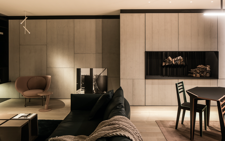
Natural materials are always a welcome addition on any home, bringing a sense of comfort and familiarity. But sometimes they can be unwieldy or expensive to use. This year a few new products on the market made them (or an approximation of them), a little more in range. The French brand Stoneleaf uses slivers of natural materials with fibreglass backing to create panels that can be used for both exterior and interior projects. With stone, marble and mica included in the range they are the perfect innovation for bathrooms and kitchens as well as dramatic feature walls in other rooms. Another standout were Concrete LCDA, slim concrete panels used to cover interior walls and bring some modernist glamour without the hefty cost, such as in this elegant sitting room. For contrast add in the new Luxaflex Duette digital print that invokes the natural beauty of marble. A little luxe against the pared back chic. Always an on-trend look.

For more ideas on what’s new in design, visit our devoted Inspiration Blog.