Named the colour of the year, 2017 was meant to be all about green. But with Spring arriving, pink has decided to take centre stage. Never being the retiring type, pink is much more versatile than just the popular pretty or punchy looks it’s known for.
Filtering Out Wintery Blues
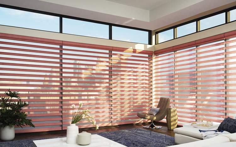
A softer way with pink is to combine it with sunlight. It warms up cold, blue, wintry light and becomes almost coral with the summer sunshine filtered through it, as with these fabric veins in the new Pirouette® collection.
Pale Pink
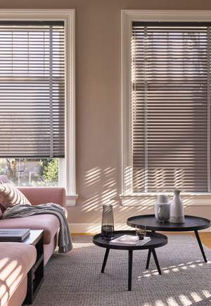
Combined with the more dramatic edge of metal, these Venetian blinds offer sophistication in a pale pink tone with a subtle contrasting decorative tape.
Sweet & Cheerful…
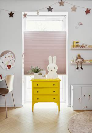
For a nursery that feels sweet but not cloying, mix up your eras. This modern playroom with contrasting pops of yellow furniture blend beautifully with pink Duette® shades and vintage accents.
Highlight With Pink
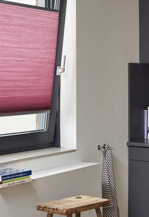
In a classic combination these rose Duette® shades take the chill factor off a dark grey kitchen. Designed to be lifted from the bottom or lowered from the top, these blinds are a great solution for combining the best available daylight with privacy – ideal if you overlook a busy street.
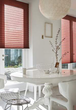
A Touch Of Rose…
White schemes have a timeless quality but can seem very frosty in the winter or give a blinding glare from the midday sun. Chosen in a gorgeous shade of pink, these Plisse blinds soften and disperse the light throughout this all white dining room.
The Luxaflex website uses cookies for analytics and third-party social plugins. For the optimal experience accept the cookie placement. Read more about our cookie policy